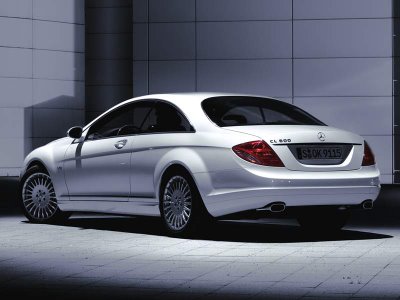
The new 2008 Mercedes Benz CL is going to be technologically advanced, but that is not going to make it a great looking car. Mercedes has been doing well lately with the new models, but I am not quite convinced the this CL600 pictured. Expect 388hp out of the CL550 and 514hp out of the twin turbo CL600. What do you think?

7 comments:
It just does not look right..... Best AMG pulls out all the stops and makes it good.
Not sure about the wheels. Not sure about the white either. Mercs look best in silver. I'll reserve judgment until I see one in silver.
It looks bad, a bit better in silver, but I am thinking that some of the winged wonders below looks better than this new CL.
Oh puleeez. I don't know about the flared rear wheel arches and the big "cut" along the side, but the backside of the CL looks fine to me. If anything, it looks a little
"Bangled". All it needs is a "hofmeister kink" in the rear quarterlight windows, and you could happily slap a blue and white propellor logo on the car.
Perhaps thats the problem - Mercedes is looking too much like BMW, but without Bangle's outrageous design to at least be called original.
Audi is looking more and more like an all round good looking brand every day.....
I'm happy with the front (a welcome return to elegant-looking headlamps), but a tad more chrome on the grille would make it look less plasticky. Haven't seen a good side photo yet. The wheels -- they look good, but are more suited to an Italian sedan. But the trunk area? Hate the lights -- if you took out the Merc nomenclature and narrowed the license plate frame it would look like some Chevy or Saturn -- something in America. The colour? On this car, white looks like putty. I'm not the biggest fan of silver, but in this case, make it silver with a greenish tint. And then again, that should show how well or poorly-styled a car is, if it looks great even in white.
While MB are mobing ahead in a technological sense the appealing nature of the exterior design does need to keep up. On the other hand, when your driving it your not too concerned with it look as you never see it while your driving.
Mike I alway used to say that about the current 7 series, although I personally think the 7 looks good.
Post a Comment